
RevisionDojo
RevisionDojo is the fastest growing edtech startup, providing digital IB study tools to 400,000+ users.
My team developed a scalable navigation system to anchor the products rapid growth.
Team
1 Designer (Me)
2 Developers
2025

The Mission
Unifying 500+ features into a new search system.
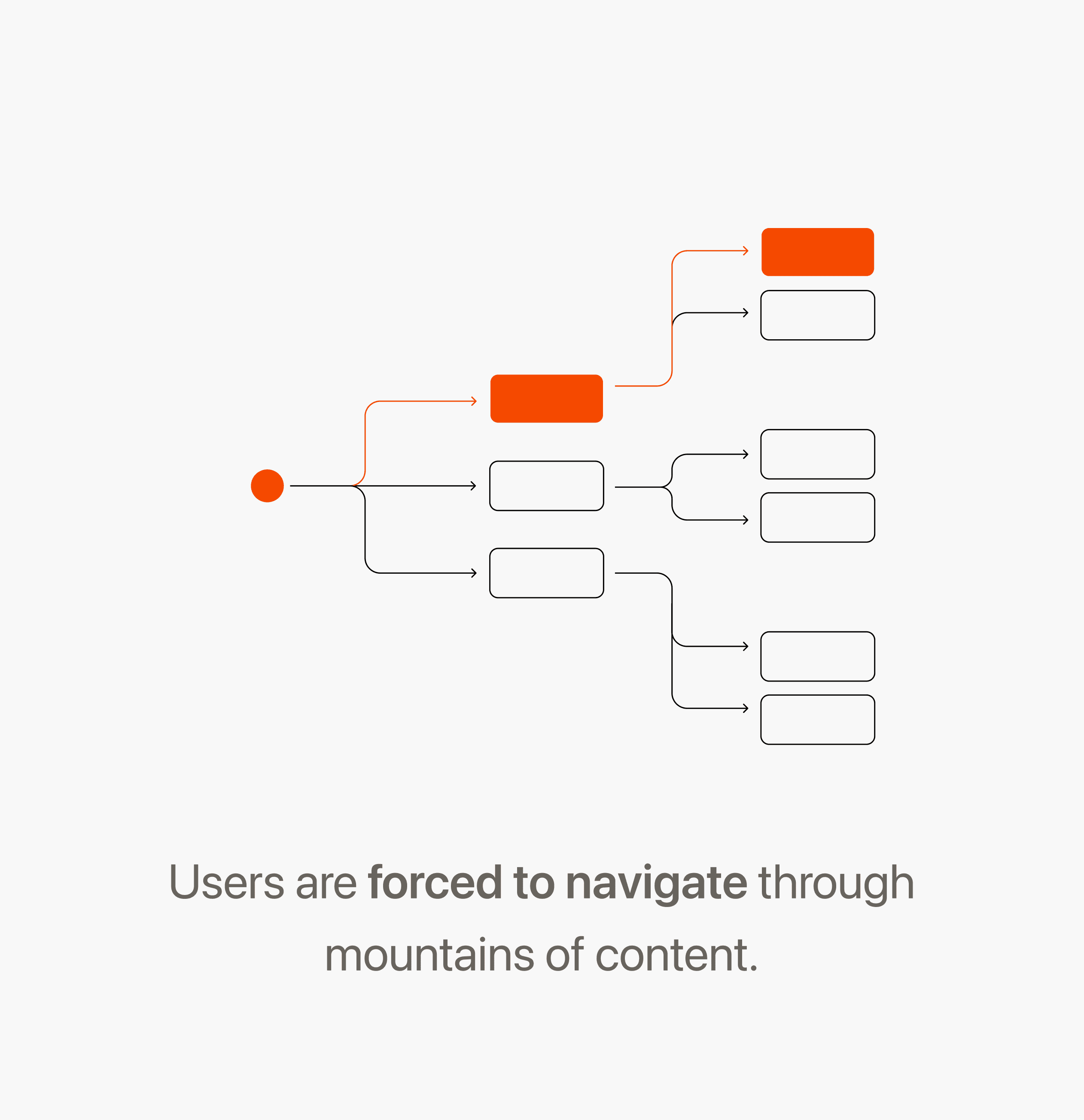
Countless documents, features and subjects are stored on RevisionDojo, but there was no reliable way for users to discover them.
Key Insight
Students need to navigate mountains of content.
Students focus on just 6/30 subjects, so the remaining content adds friction instead of value.
Key Insight
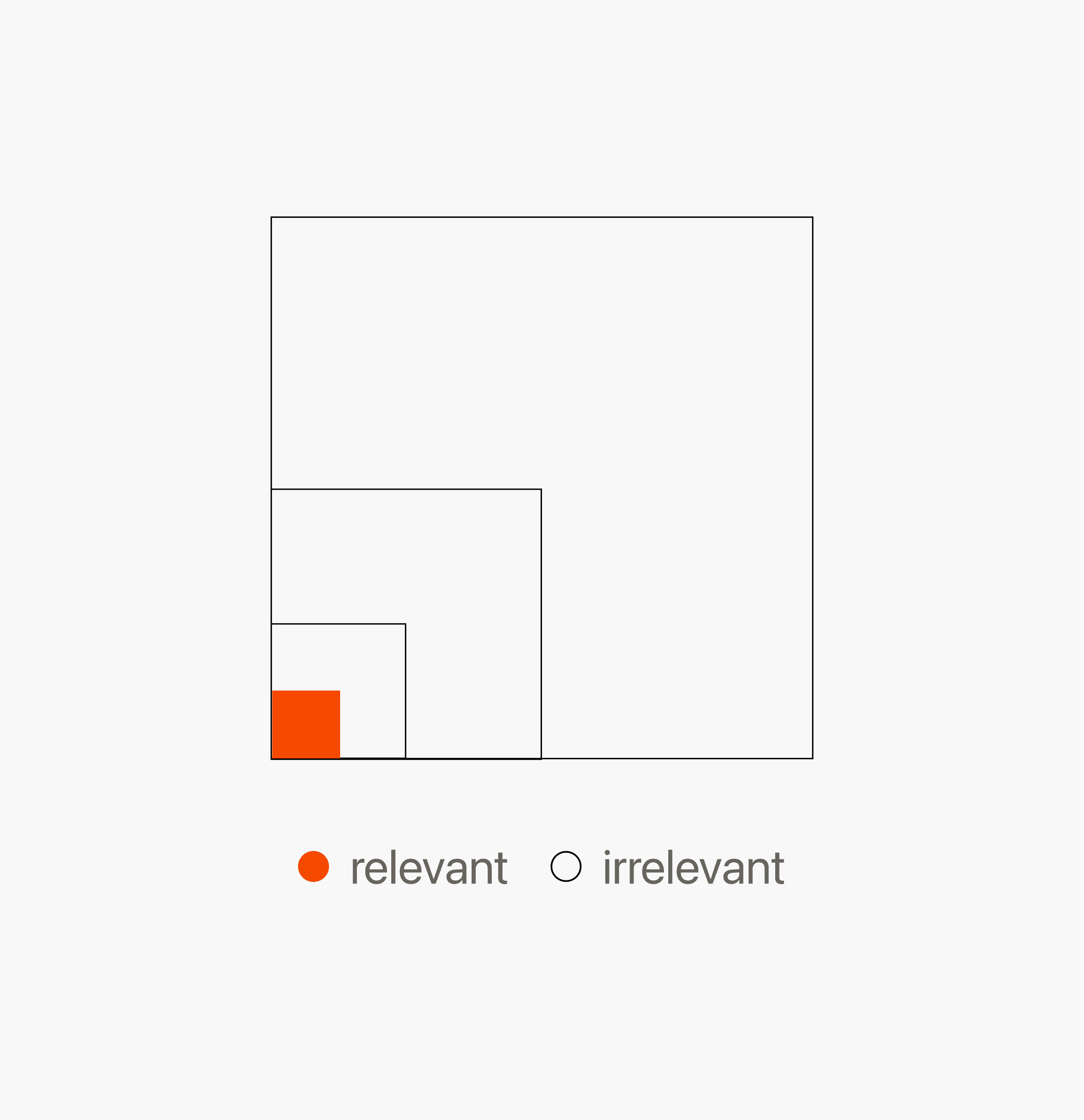
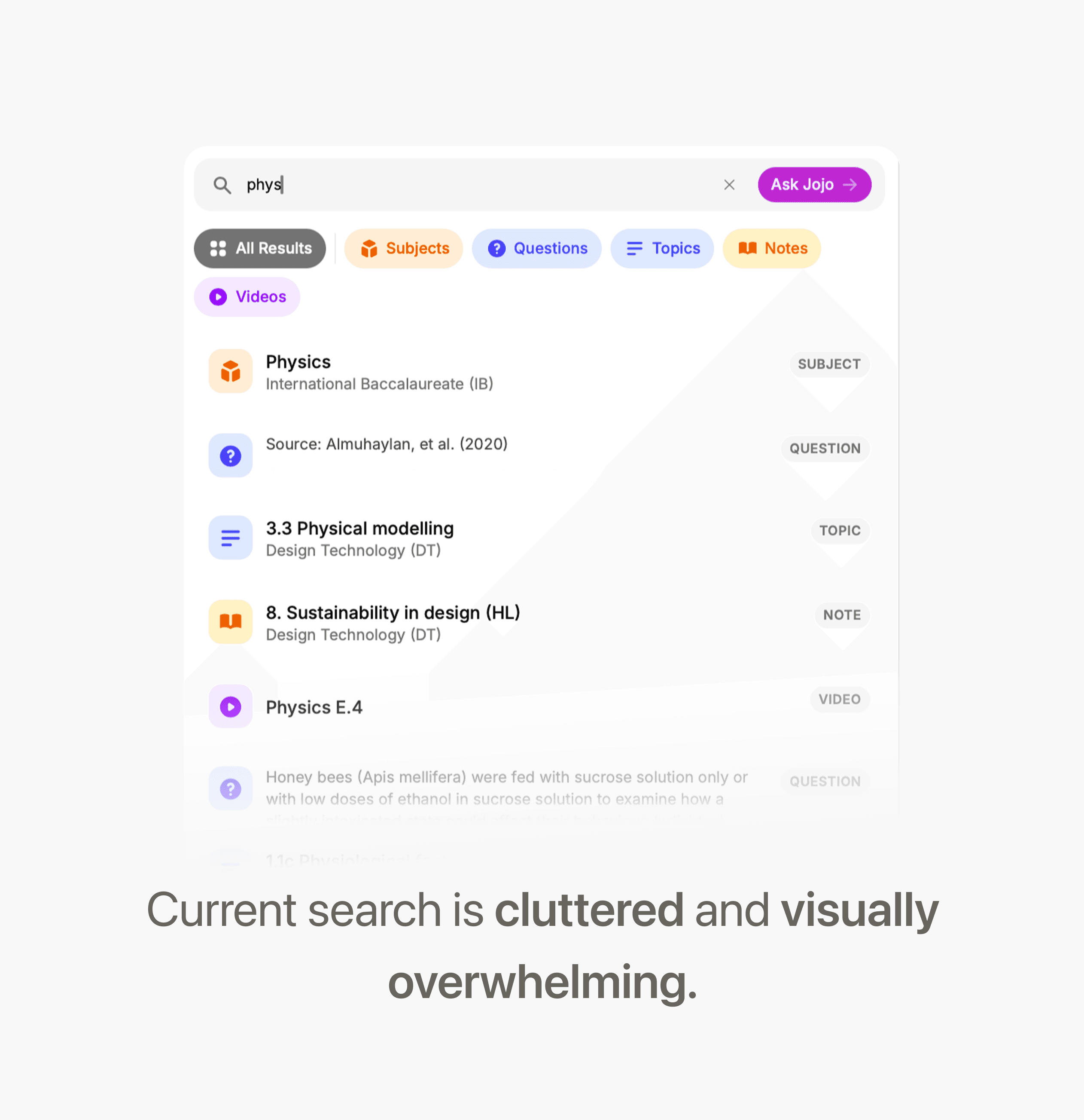
No features supported large-scale search.
Hundreds of results are returned in a single infinite list without reliable means to filter though them.
Solution
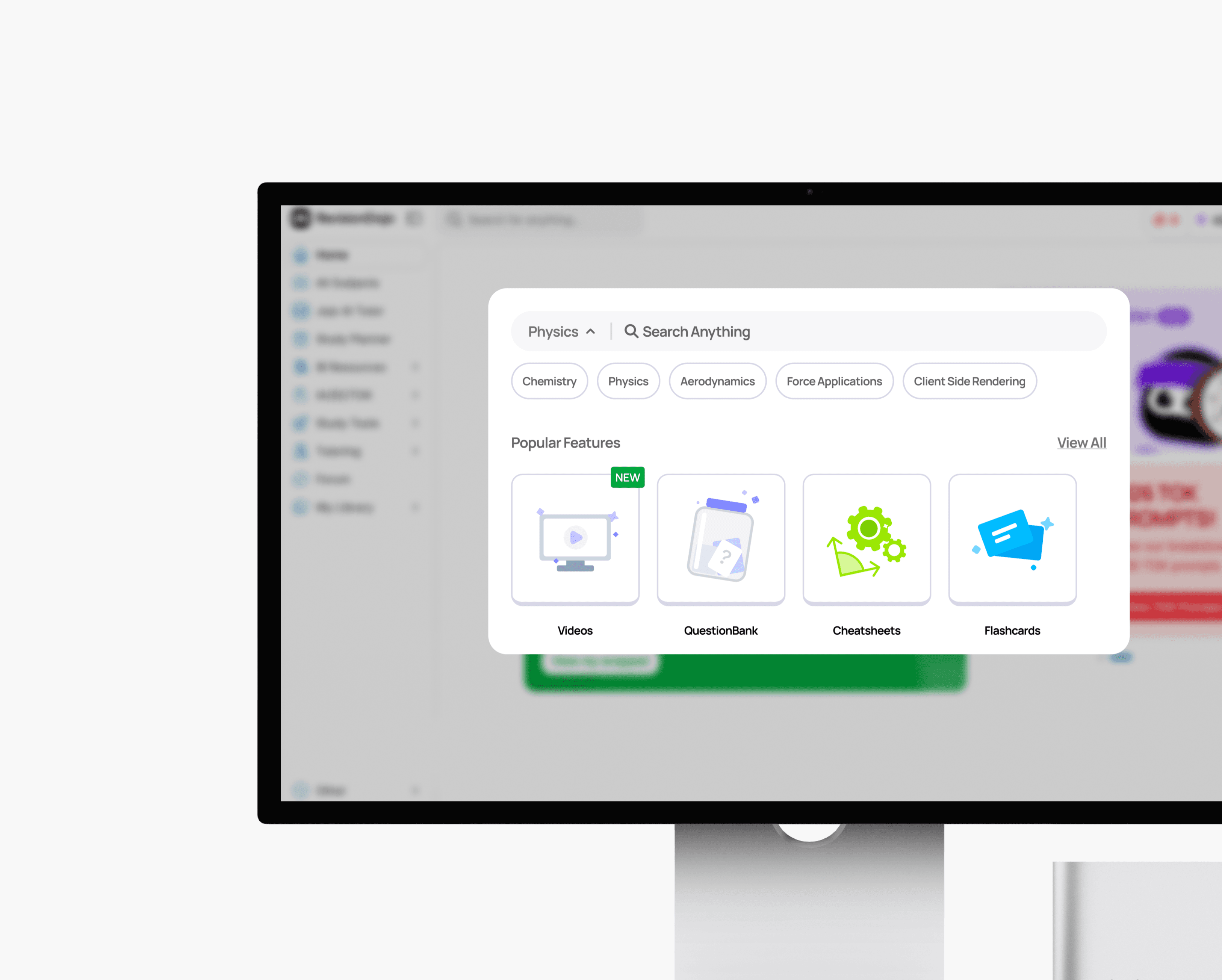
Segmenting search through filters
Search that knows what you're looking for. By filtering by subject first, results are scoped before you ever type a keyword — so you're choosing from 24 relevant results, not scrolling through hundreds.
Select a subject before a feature.
Solution
Helping users overcome decision paralysis
Insights from user research revealed that blank search screens were daunting. So we added a pre-search screen filled with features and options to provide visual guidance.
Exerpts from our solution
Design Decision
Contextualizing a whole feature in just a moment
Each cell's content was carefully considered. Students could be crawling through hundreds of results, so we needed to make sure we could communicate a whole feature's value in just a few points.
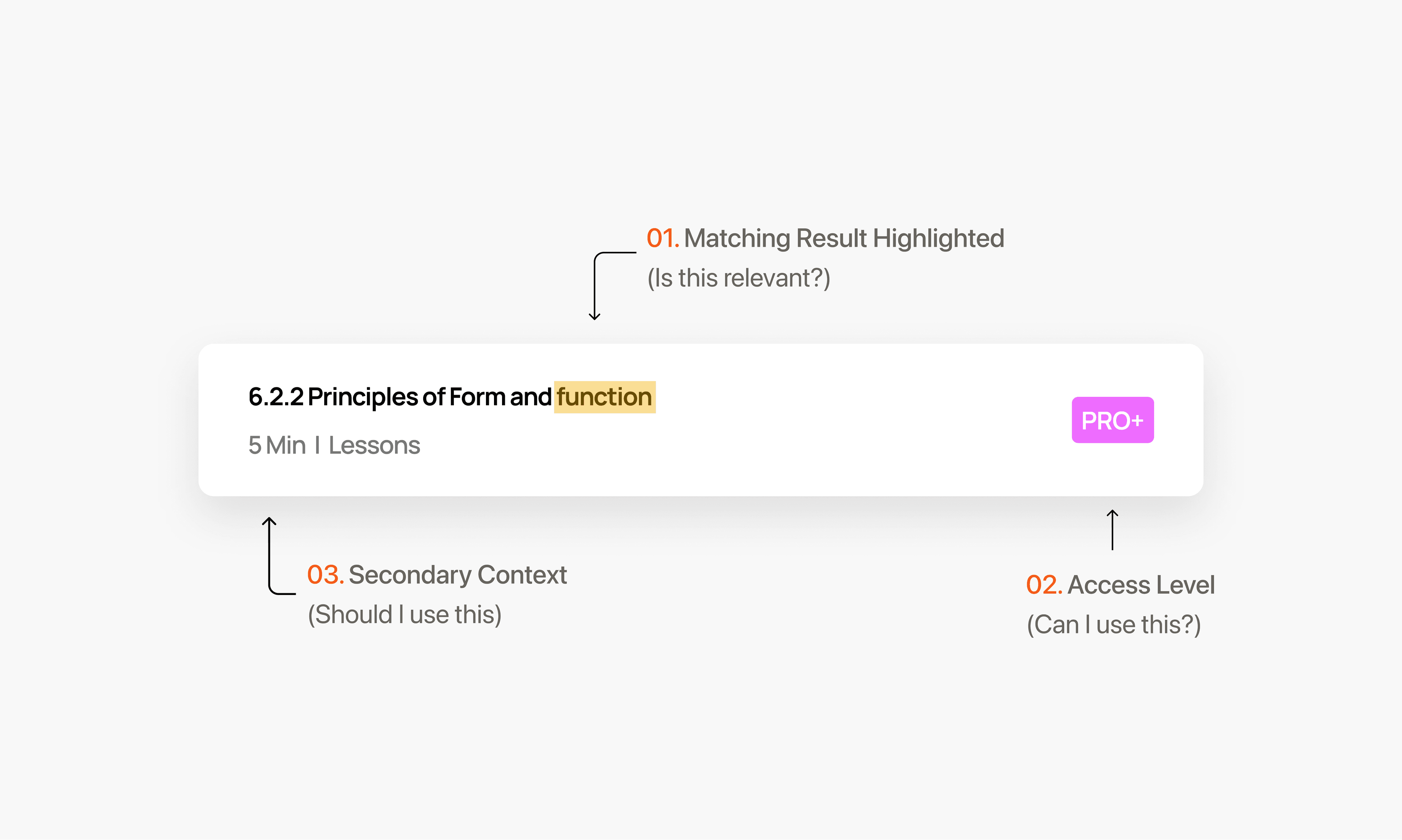
Breaking down the anatomy of a feature block.
Design Decision
Conveying features beyond text descriptions.
The search bar also supports feature discovery for new users. Since many of RevisionDojo's features are unfamiliar, I created illustrations to help communicate their purpose at a glance without relying on heavy text.
All hand drawn in Figma
Research
Context
Where it all started
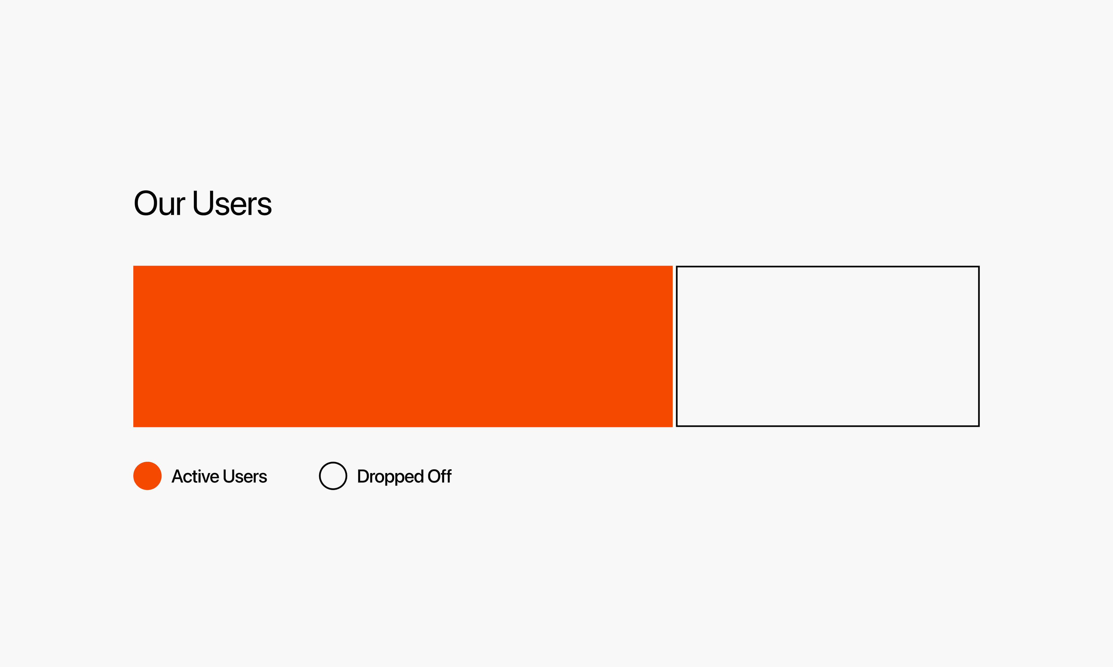
RevisionDojo's content, features, and subject coverage dwarfs our competitors.
Yet consistently, through each update, new feature added, and content added, we would see the same staggering amount of drop off.
Research
So... why wasn't this happening?
Analyzing session recordings, user reviews, reddit ect.. I realized the most concentrated drop off point was right after onboarding.
Why wasn't our product converting?
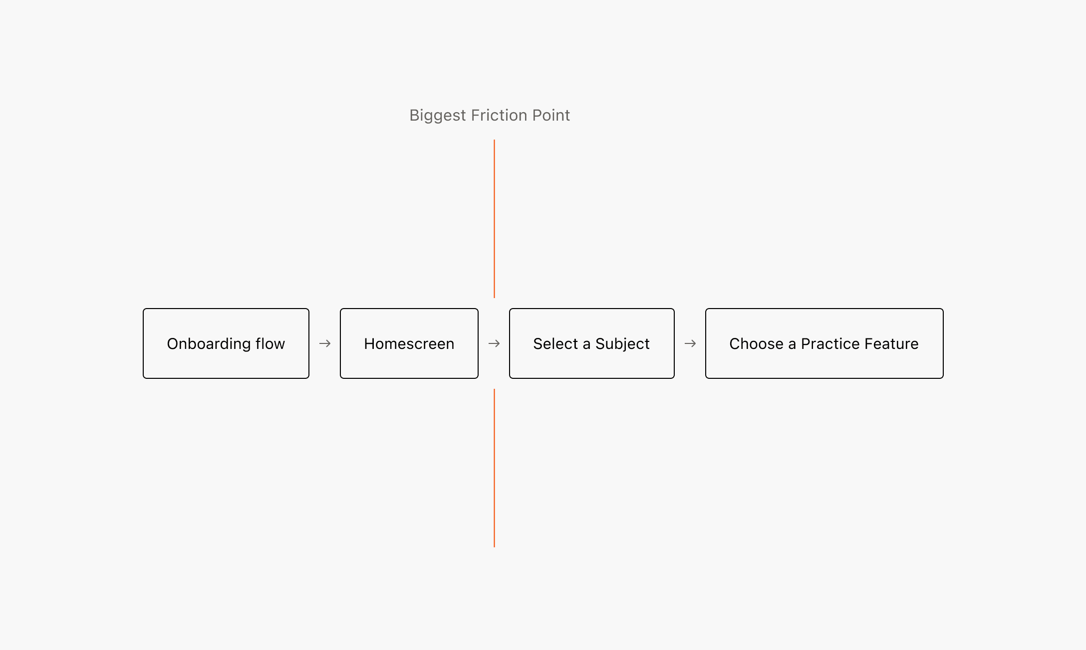
The biggest pain point.
Research
Researching pain points and understanding user rationale.
While I had my own assumptions about why users dropped off, what better way to understand the process (and avoid assumptions!!) then to ask the users.
Goals:
1. Understand rationale for drop off.
2. Identify motivations for new users that convert.
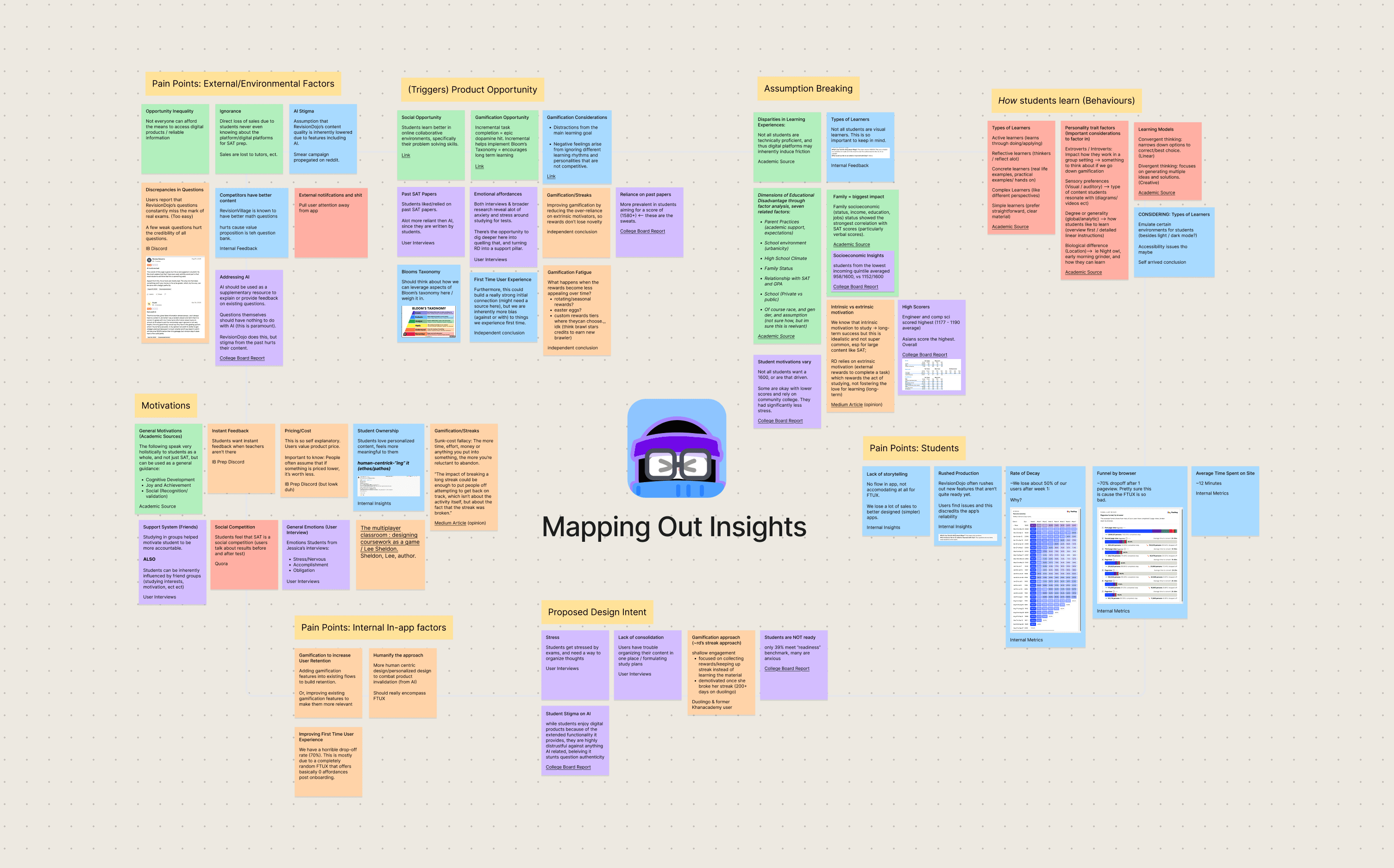
All of our sorted insights.

Our Audience
60 Surveyants, 12 User Interviews: We surveyed both new and existing users — to uncover friction points driving drop-off, and to understand the workarounds and habits long-term users had developed.
Research
Consolidating data from the UXR campaign into insights.
Our research yielded several key insights, which culminated in our north star guiding principle:
1. IB Students drop off after ~25s
2. We can extrapolate a clear goal via subject resonace from users.
3. The relevancy of a site is determined by how closely our content aligns with class curriculum.
Our North Star
It is imperative that we get relevant content in front of users as soon as they hit the site.
Solution Ideation
Evaluating ideas against research and technical constraint.
Since I worked closely with the engineering team and founders, I had the opportunity to pitch each of these solutions, aligning them with technical constraints, product goals, and what it would offer the broader app.


The search bar was the best option.
Initial solutions, while promising, were not uniquely positioned to validate subject resonance for users in the first 2 minutes.
Solution Ideation
Transitioning from ideation to implementation
Nowadays, there are so many different ways to build search. Informed by competitive research, I built many, many, many variations of the searchbar before settling on a final design.
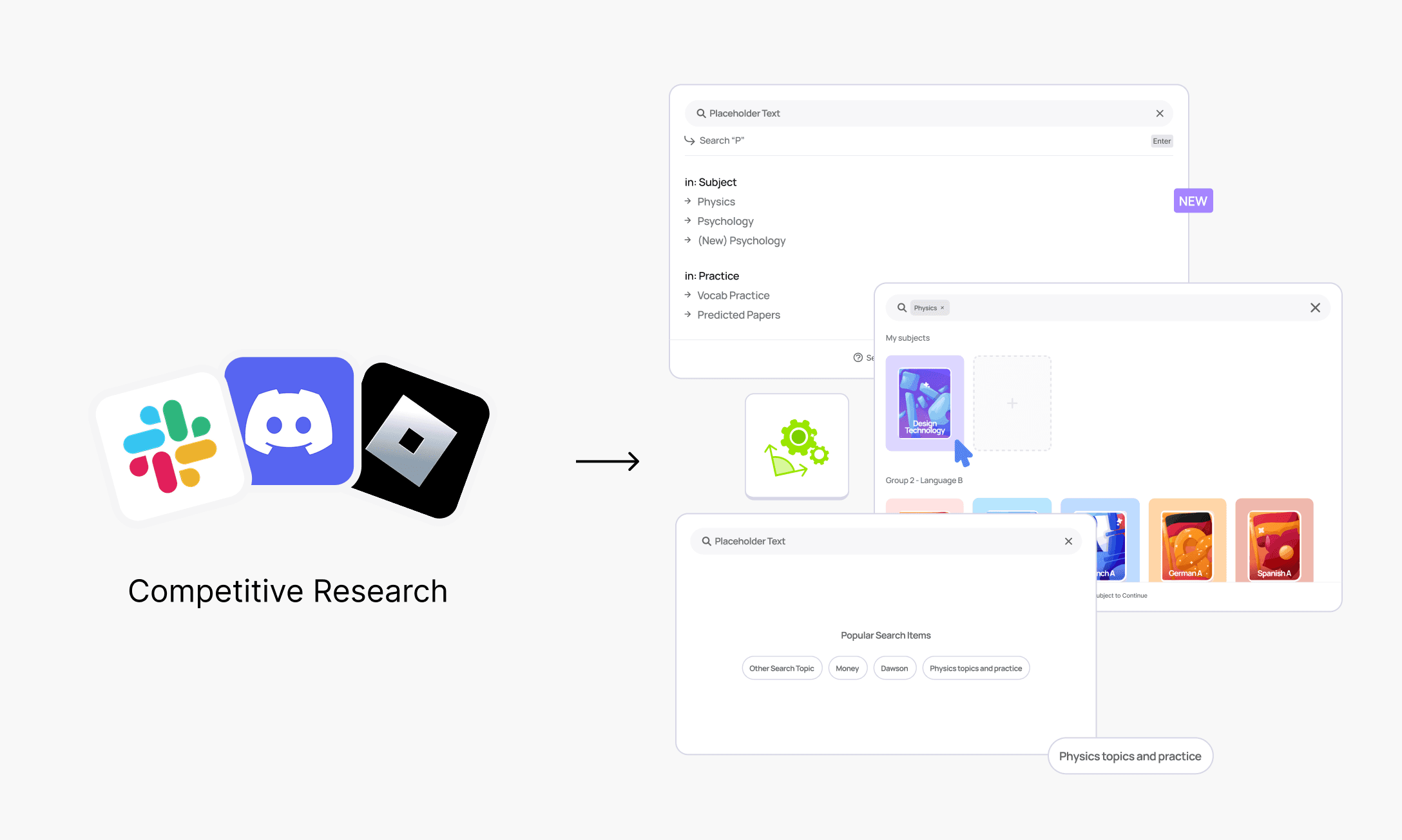
Many, many many ideations were built.
Solution Ideation
Testing the prototype with users, engineers, and the founders.
After ideating many many many wireframes, I consolidated my features into a final prototype, which was prepared for testing with users and the founding team.
Initial prototype
Solution Ideation
Making difficult decisions post user testing
Testing with users, the founding team, and engineers revealed quite a few valuable insights that challenged our initial solution:
Users felt way too much pressure to choose a subject, then a corresponding feature. (Largely due to not understanding all the different features, since many were native to the webapp)
User feedback we received
Final Solution
Landing on the Final Solution
We recognized that most users wouldn't understand our features to the point of deriving value from them ("whats question rush, and why do I care about it?), so a good middle point was navigating them to the subject itself, and letting them crawl from there via a directory of features
What we initially assumed to help with precise decision making, actually created decision paralysis.
The final solution, and reaction.
Key Learnings
-
Don't reinvent the wheel and over engineer a crazy complicated solution for a simple problem. Alot of this project was spent learning to lean on precedents.
-
Be a chronic communicator. It became a habit to share updates/looms with engineers, teammates, and stakeholders to keep everyone up to date.
